
Loading article…

多色装飾とは、「建築要素や彫刻などをさまざまな色で装飾する慣習」のことである。[ 1 ]この用語は、複数の色を用いた特定の様式の建築、陶器、彫刻を指すのに用いられる。
古代やヨーロッパ中世の美術品や建築物を見ると、単色だったと思われがちです。しかし実際には、ルネサンス以前の時代は色彩豊かで、現在では白、ベージュ、グレーになっているギリシャ・ローマ彫刻やゴシック大聖堂も、当初は様々な色で彩色されていました。アンドレ・マルローが述べたように、「アテネは決して白ではなかったが、色彩を欠いたアテネの彫像がヨーロッパの芸術的感性を形作ってきた。[…] 過去全体が無色のまま私たちに伝わってきたのだ。」[ 2 ]多色彩は西洋世界だけに限定されたものではなく、中国の寺院、オセアニアのウリ像、マヤの陶器の花瓶など、西洋以外の美術品も多色で装飾されていました。
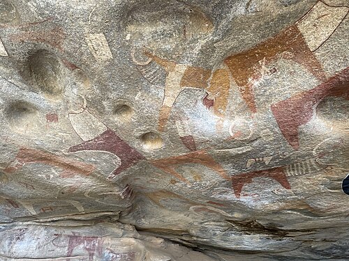
先史時代とは、一般的に、記録された歴史が始まる以前の人類史の時代を指します。この時代を通して、多くの多色美術作品が制作されました。今日まで残っている多色美術作品の中で最も一般的なものは、絵画、陶器、彫刻です。文字体系の発達は文化によって異なるため、記録された歴史がいつ始まり、先史時代がいつ終わるのかは、文化によって異なります。




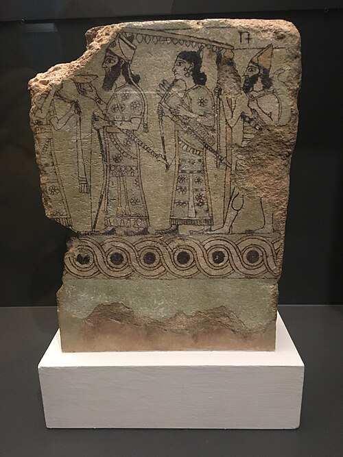
他の地域の古代美術と同様に、古代近東美術も多色で、鮮やかな色彩が特徴的でした。現在では多くの彫刻が元の色彩を失っていますが、色彩がそのまま残っている例もいくつかあります。その中でも特に優れた例の一つが、バビロン内城への8番目の門であるイシュタル門です(現在のイラク、バビル県ヒッラ付近)。紀元前575年頃、ネブカドネザル2世の命により、都市の北側に建設されました。この門は、都市へと続く壮大な城壁に囲まれた行列路の一部でした。壁が釉薬をかけたレンガでできていたため、その色彩は当時と変わらず鮮やかです。
古代近東の彫刻の多くも彩色されていた。例えば、現在ではほとんどが石の色を保っているが、王宮を飾っていたアッシリアのレリーフはすべて、非常に鮮やかな色彩で彩色されていた。




エジプトの乾燥した気候のおかげで、多くの古代の円形彫刻、レリーフ、絵画、さまざまな物品の本来の色がよく保存されました。古代エジプト建築の最も保存状態の良い例のいくつかは墓で、内部は明るい色で彩色された彫刻レリーフやフレスコ画で覆われています。エジプトの芸術家は主に黒、赤、黄、茶、青、緑の顔料を使用しました。これらの色は、粉末状の鉱物、合成材料(エジプトブルー、エジプトグリーン、ガラスや陶器の釉薬を作るのに使用されたフリット)、炭素ベースの黒(すすと木炭)から得られました。ほとんどの鉱物は、酸化鉄顔料(赤土、黄土、アンバー)、エジプトの広大な石灰岩の丘で見つかる炭酸カルシウムから得られる白、アズライトとマラカイトから得られる青と緑など、地元で入手できました。
装飾効果に加えて、色は象徴的な意味合いでも使われていました。彫刻、棺、建築物に使われている色は、美的意味と象徴的意味の両方を持っていました。古代エジプト人は黒を肥沃な沖積土の色と見なし、豊穣と再生と結びつけていました。黒は死後の世界とも関連付けられ、アヌビスのような葬儀の神の色でもありました。白は純粋さの色であり、緑と青は植物と若返りと関連付けられていました。そのため、オシリスはしばしば緑色の肌で描かれ、第26王朝の棺の顔はしばしば緑色でした。赤、オレンジ、黄色は太陽と関連付けられていました。赤は砂漠の色でもあり、セトと破壊の力と関連付けられていました。[ 5 ] [ 6 ]
その後、19世紀には、古代エジプトの芸術と文化をカタログ化することを目的とした探検が行われました。『エジプト誌』は、古代エジプトの遺跡や遺物の図版が満載された19世紀初頭の出版物シリーズです。ほとんどは白黒ですが、一部は色彩豊かで、過去の多色性を伝えることができます。壁、柱、彫刻にはわずかな塗料の痕跡しか残っていない場合もありますが、イラストレーターたちは建物の元の状態を絵で表現することに成功しています。[ 7 ]

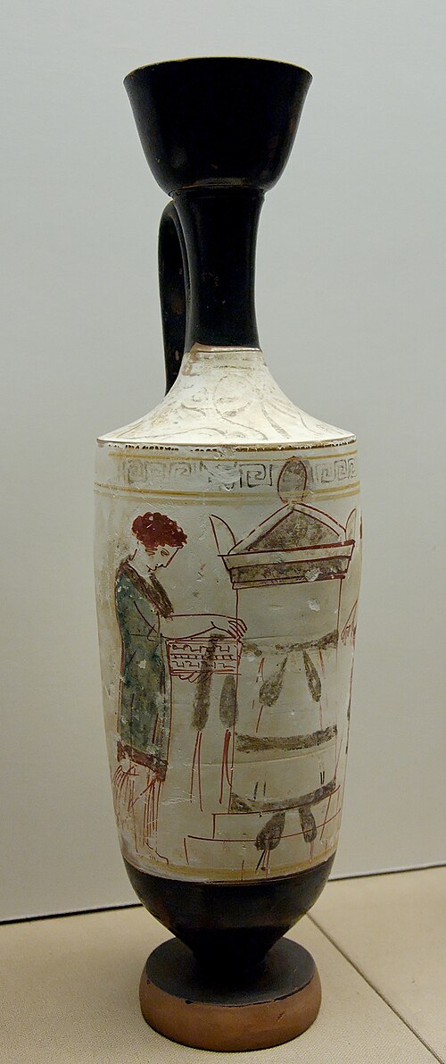
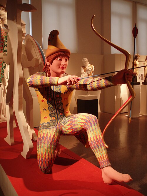
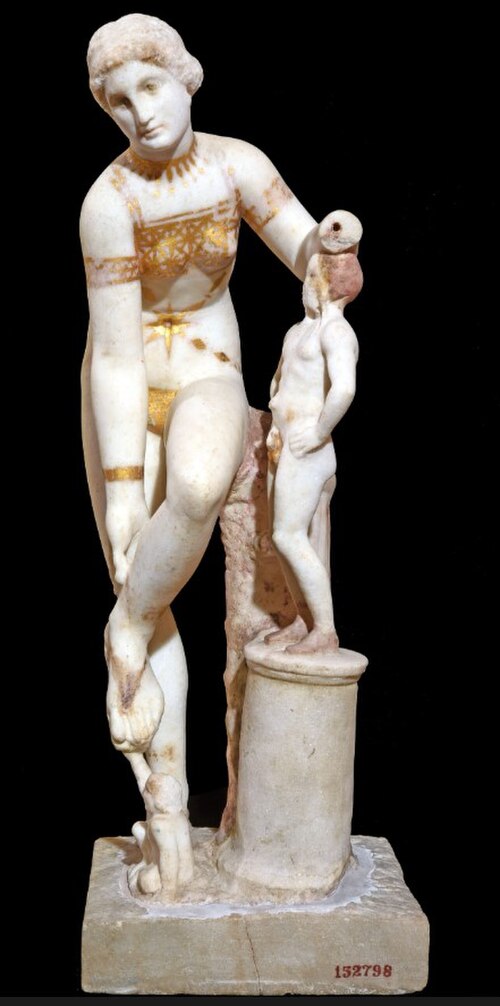
ミノア文明のクレタ島では、青銅器時代のファイストス遺跡など、非常に初期の多色陶器が発掘されている。[ 9 ]古代ギリシャと古代ローマの両方で、彫刻は鮮やかな色彩で彩色された。彩色は衣服や髪などを描写する部分に限られ、肌は石の自然な色のままにされることが多かった。しかし、多くの彫刻は全体が彩色されていた。ギリシャとローマの彫刻の彩色は、単に彫刻された形を補強するものと見なすべきではなく、独特の芸術様式の特徴を持っている。例えば、アイギナ島のアファイア神殿の破風彫刻は、大胆で精巧な模様で彩色され、模様のある衣服などの細部が描かれていたことが最近明らかになった。石像の多色装飾は、金象牙彫刻における肌、衣服、その他の細部を区別するための素材の使用や、リアーチェ青銅像のような高品質の青銅像における唇、乳首などを描写するための金属の使用と並行して行われていました。現代のデジタル手法と技術の利用により、古代の3D多色装飾を科学的に妥当な方法で復元および視覚化することが可能になり、近年、多くのプロジェクトがこれらの可能性を探求してきました。[ 10 ]
多色装飾の初期の例は、アテネのアクロポリスの頂上にあるパルテノン神殿で発見されました。しかし、18世紀にヨーロッパの古物研究が盛んになる頃には、古典建築に塗られていた塗料は完全に風化していました。そのため、古物研究家や建築家は、これらの遺跡を見て、古典美は形と構成のみで表現され、力強い色彩に欠けているという印象を抱き、それが新古典主義建築に影響を与えました。しかし、ジャック・イニャス・ヒトルフなどの一部の古典学者は、古典建築に塗料の痕跡があることに気づき、これが徐々に受け入れられるようになりました。その後、顕微鏡などによる微細な色の痕跡の観察によって、ヒトルフや同時代の人々が行ったよりも、より正確な復元が可能になり、こうした認識は加速しました。古典ギリシャ建築の多色装飾の例は、アメリカ合衆国テネシー州ナッシュビルに展示されているパルテノン神殿の実物大レプリカで見ることができます。








中国美術は鮮やかな色彩の使用で知られています。仰韶文化などで作られた新石器時代の中国の陶器には、黒と赤の顔料が使われています。その後、仏教の普及に伴い、墓や宗教的な彫刻が登場しました。中国の仏教彫刻で最もよく見られる神像は、仏陀と観音菩薩の姿です。彫刻に施された金や鮮やかな色の痕跡は、当時の効果を今に伝えています。漢王朝と唐王朝の時代には、召使い、芸人、小作人、兵士などの多色陶器の人形が上流階級の人々の墓に納められました。これらの人形は型を使って大量生産されました。中国の磁器といえば青と白が最も有名ですが、明王朝と清王朝の時代には、色彩豊かな陶器の花瓶や人形が数多く作られました。同じ二つの王朝時代には、銅線(クロワゾン)と光沢のあるエナメルを用いた七宝焼きの器も製造された。
中国で起こっていたことと同様に、538年(あるいは552年)に日本に仏教が伝来したことで、彩色された日本の仏像が作られるようになった。それまでの日本の宗教的なイメージは、霊界に祈りを伝えるために使われる使い捨ての粘土像で構成されていた。[ 18 ]


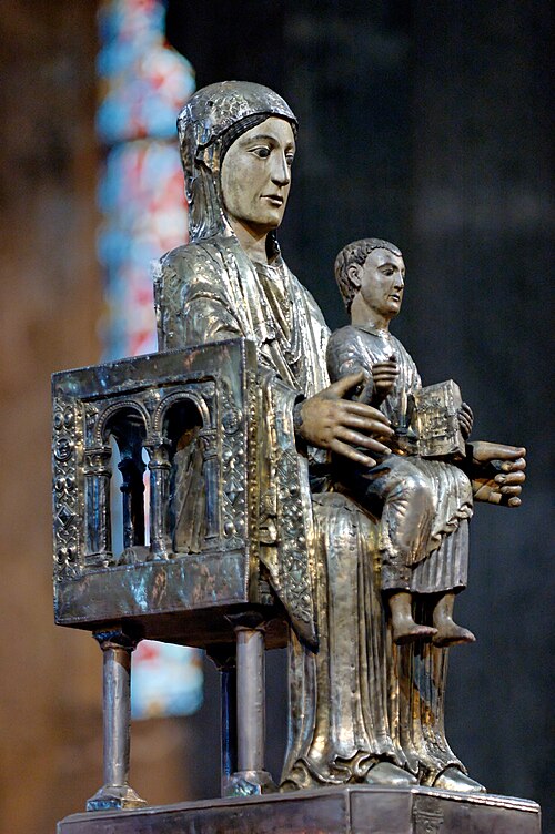
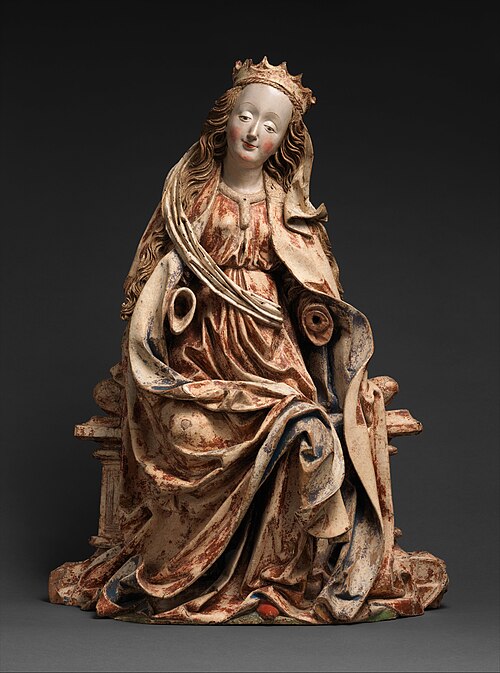
中世ヨーロッパでは、木やその他の素材で作られた宗教彫刻は、教会の建物の内部と同様に、しばしば鮮やかに彩色されていました。これらは、プロテスタント改革の偶像破壊運動やフランス革命などの混乱期に破壊されたり、白く塗りつぶされたりすることが多かったのですが、ヴィクトリア&アルバート博物館、クリュニー美術館、ルーブル美術館などの博物館に現存しているものもあります。教会の外装も彩色されていましたが、現存するものはほとんどありません。風雨にさらされることや、時代とともに変化する嗜好や宗教的承認が、それらの保存を妨げてきました。現存する彩色外装の最も広範囲な例の1つは、スペインのトロ参事会教会の「マジェスティ・ポータル」です。これは、完成からわずか1世紀後に、それを囲んで風雨から守る礼拝堂が建設されたためです。[ 22 ]





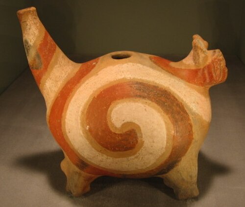
コロンブス以前の芸術は、一般的に、ヨーロッパによる植民地化が始まる以前のカリブ海、北アメリカ、中央アメリカ、南アメリカの先住民の視覚芸術を指します。今日まで残っている彼らの芸術の最も一般的な形態は、陶器、彫刻、金属工芸品、絵画であり、そのほとんどが多色で保存されています。多色彫刻の例としては、サン・ロレンソ・テノチティトランの先史時代のオルメカの巨大な頭像の1つがあり、石膏と赤い塗料の痕跡が残っています。[ 30 ]




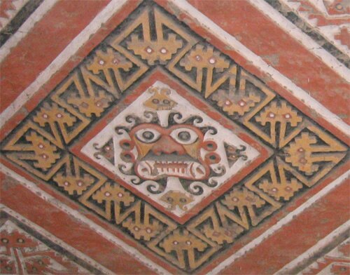

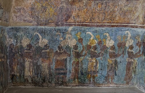

石や金属の彫刻は通常、古典期の遺物のように無彩色であったが、彩色された木彫は、スペインの芸術家であるフアン・マルティネス・モンタニェス、グレゴリオ・フェルナンデス(17世紀)、ドイツの芸術家であるイグナツ・ギュンター、フィリップ・ヤーコプ・シュトラウブ(18世紀)、ブラジルの芸術家であるアレイジャジーニョ(19世紀)によって制作された。
後期のダイナミックなバロック様式においても、ボッロミーニやグアリーニの思想に基づき、単色の建築様式が考案された。単色の石材被覆が用いられ、例えば、ゲオルクとレオンハルト・ディエンツェンホーファー(1686~1693年)が設計したバンベルクのイエズス会教会のファサード(グンツェルマン 2016)、レオンハルト・ディエンツェンホーファー(1696年)によるミヒェルスベルクの修道院教会のファサード、JB・ノイマン(1747~1792年)によるネレスハイムの修道院教会のファサードなどが挙げられる。[ 32 ]
現在のドイツにあたる地域では、18 世紀にアサム兄弟 (エギド・クィリン・アサムとコスマス・ダミアン・アサム) が波打つ壁、曲線の破風、多色装飾の教会を設計しました。 [ 33 ]ドイツ語圏では、パステルカラーの多色漆喰と柱を備えたロココ様式の教会や図書館が数多く建てられました。そこでは、模造大理石の柱は、石膏、石灰、顔料を混ぜ合わせた多色漆喰の層で覆われた木の柱から作られています。これらの材料を混ぜ合わせると、均質な色のペーストができます。大理石のような外観にするために、濃い色と薄い色のペーストを薄く混ぜ合わせ、筋模様が現れるようにします。これらはすべて手作業で大まかに混ぜ合わせます。材料が固まったら、細かいサンドペーパーで磨くと、この多色漆喰の層は光沢を帯び、非常にリアルな大理石を模倣します。その好例として、ドイツのウルムにあるヴィブリンゲン修道院の図書館が挙げられます。漆喰で作られた擬似大理石は、19世紀から20世紀初頭にかけても引き続き使用されました。ただし、漆喰は水に触れると溶けてしまうため、屋外では内装にのみ使用されました。
17世紀後半から18世紀初頭にかけて、ワラキア地方ではブランコヴェネスク様式が建築や装飾芸術において人気を博しました。この様式は、コンスタンティン・ブランコヴェアヌ公の治世中に発展したことにちなんで名付けられました。この様式の教会の中には、ルーマニアのブカレストにあるスタヴロポレオス修道院の教会のように、壁画で装飾された多色ファサードを持つものもあります。
18世紀後半は新古典主義の隆盛期であり、この運動は古代ギリシャ、ローマ、エトルリア文明、そして時にはエジプトの様式を復活させようと最大限努力した。ルイ16世の治世(1760~1789年)には、ルイ16世様式の室内装飾に、ポンペイやヘルクラネウムの古代の家屋で発見されたものに触発されたアラベスク模様が用いられるようになった。それらはパステルカラーで塗られたり、白地に装飾的な部分を金箔で塗られたり、多色で塗られたりした。スコットランドのインヴァレリー城の国賓食堂は、2人のフランス人画家によって装飾されたもので、多色で彩られたルイ16世様式の室内装飾の好例である。


![ロココ – シュタインハウゼン城壁の首都 [デ]、ドイツ、シュタインハウゼン、ドミニクス・ツィンマーマン作、1728 ~ 1733 年](https://img-server.japedia.wiki/wikipedia/commons/thumb/d/df/Steinhausen%2C_Wallfahrtskirche_Unserer_Lieben_Frau%2C_Capital_002.JPG/500px-Steinhausen%2C_Wallfahrtskirche_Unserer_Lieben_Frau%2C_Capital_002.JPG)


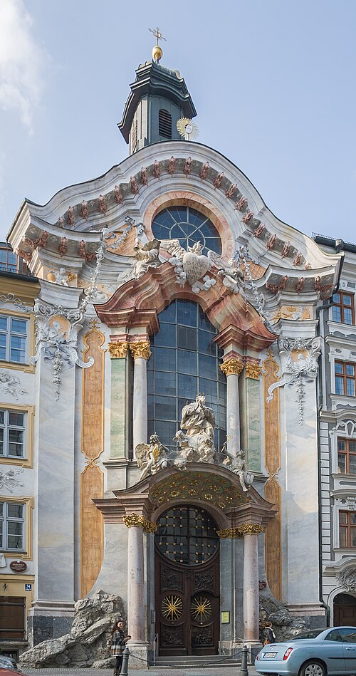


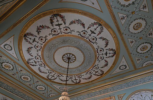
18世紀にヨーロッパの磁器が伝来すると、色彩豊かな陶器の置物が大変人気を博しました。磁器は9世紀に中国で開発されました。その製法は他国には秘密にされ、15世紀になってようやく日本とベトナムで模倣に成功しました。18世紀には、錬金術師のヨハン・フリードリヒ・ベトガーと物理学者のエーレンフリート・ヴァルター・フォン・チルンハウスが1709年にヨーロッパ初の磁器を製造し、ドイツの窯元がようやく磁器の製造方法を確立しました。翌年にはマイセン磁器工場が設立され、ヨーロッパを代表する磁器メーカーとなりました。その後、他の窯元も製法を盗んだり、独自の磁器技術を開発したりしました。もう一つ非常に有名な工場はセーヴル窯で、18世紀、19世紀、20世紀にフランスのエリート層向けに素晴らしい磁器を生産しました。[ 44 ]


![ルイ16世様式 – 花瓶(デュプレシス・レクティフィエ・グレック)、デザインはジャン=クロード・シャンベラン・デュプレシスによるものとされ、彩色装飾はヴァンサン・タイランディエ[fr]、金彩はジャン=ピエール・ブーランジェ、セーヴル磁器工場製、1780年、彩色金彩硬質磁器、金メッキブロンズ、アムステルダム国立美術館、オランダ](https://img-server.japedia.wiki/wikipedia/commons/thumb/0/0b/Vase_%28vase_grec_Duplessis_rectifi%C3%A9%29%2C_design_attributed_to_Jean_Claude_Duplessis%2C_Rijksmuseum%2C_Amsterdam%2C_the_Netherlands.jpg/500px-Vase_%28vase_grec_Duplessis_rectifi%C3%A9%29%2C_design_attributed_to_Jean_Claude_Duplessis%2C_Rijksmuseum%2C_Amsterdam%2C_the_Netherlands.jpg)
18世紀と比較すると、19世紀には多色装飾がやや普及した。しかし、ほとんどの建物のファサードは白のままで、ほとんどの彫刻は無彩色であり、ほとんどの家具は素材の色調のままだった。色は通常、建物には釉薬をかけた陶器、彫刻には様々な種類の石、そして家具には絵画や象嵌細工によって加えられた。18世紀と同様に、磁器は非常に色彩豊かで、多くの人物像は生き生きとしていた。外観とは対照的に、裕福な人々の多くの邸宅の内部は、しばしば木製パネル、漆喰、または絵画で装飾されていた。18世紀後半と同様に、多くのブロンズ製の時計や装飾品は、金メッキと緑青によって2色の色合いを呈していた。さらに色彩を豊かにするために、磁器の要素も加えられた。


古代ギリシャの建築や彫刻に多色装飾の証拠が発見されているにもかかわらず、新古典主義建築のほとんどは白またはベージュのファサードと黒い金属細工で構成されている。1840年頃、フランスの建築家ジャック・イニャス・ヒトルフはシチリア建築の研究を発表し、色彩に関する広範な証拠を記録した。「多色装飾論争」は10年以上にわたって激しく繰り広げられ、ヨーロッパ中の新古典主義建築家にとって大きな課題となった。[ 15 ]
18世紀にローマの都市ポンペイとヘルクラネウムでフレスコ画が発見されたため、18世紀から19世紀にかけて建てられた多くの新古典主義様式の邸宅の内部は、色彩豊かなポンペイ様式のフレスコ画で装飾されています。これらのフレスコ画には、しばしば「ポンペイ赤」として知られる鮮やかな赤色が用いられています。ポンペイ様式の絵画が流行した結果、部屋は鮮やかな色のブロックで仕上げられるようになりました。例としては、ケンブリッジシャーのヒンクストン・ホールのポンペイ・ルーム、アシャッフェンブルクのポンペイアヌム、マルメゾン城のジョゼフィーヌ皇后の寝室、ランブイエ城のナポレオンの浴室などが挙げられます。19世紀初頭には、画家たちは大理石模様や木目を模した効果を生み出すこともできるようになりました。


![新古典主義 – グランド フォンテーヌのプット (レオポルド ロベール通り)、スイス、ラ ショー ド フォン、マクシミリアン ルイ ブルジョワ [fr] 作、1888 年](https://img-server.japedia.wiki/wikipedia/commons/thumb/f/f2/Fontaine1.jpg/500px-Fontaine1.jpg)


「多ければ多いほど良い」というのが、ヴィクトリア朝時代に信奉された美的原則でした。陶磁器、家具、カトラリー、食器、ファッション、建築、書籍の挿絵、時計など、ヴィクトリア朝時代のデザインの多くの種類にマキシマリズムが見られます。装飾への欲求があったにもかかわらず、特に家具など、多くのものは少数の色で装飾されています。陶磁器は多色装飾が広く普及した分野でした。多色陶磁器は、物品だけでなく、建築や一部の家具、タイルなどにも用いられました。
このページのギャラリーに掲載されている19世紀の物品や建築物は、疑いなく印象的です。今日、私たちはそれらの装飾、色彩、様式に魅了されています。しかし、1960年代にポストモダニズムが台頭し、人々がモダニズムに疑問を抱き、近代以前の過去のものを評価し始めるまで、ヴィクトリア朝のデザインに対する評価は芳しくありませんでした。20世紀初頭、そしてそれらが作られた当時でさえ、ヴィクトリア朝時代は、これまで作られた中で最も醜いものを生み出した時代だと評する人もいました。「美的怪物」や「装飾的忌まわしいもの」といった表現が当時から使われており、状況は悪化する一方でした。 19世紀末、ミントン社で働いていた著名な陶磁器デザイナー、マルク=ルイ・ソロン(1835-1913)は、この時代は「全く悪趣味の痕跡が残っている」とコメントしたが、これは珍しいことではなかった。 [ 50 ]時が経つにつれ、否定的な意見は悪化するばかりだった。近代建築の先駆者であるアドルフ・ロースとル・コルビュジエは、このような作品は単に悪いだけでなく、あまりにも侮辱的であるため、違法にすべきだと考えた。[ 51 ]


多色レンガ積みは、1860年代に登場した建築用レンガ積みの様式で、さまざまな色(茶色、クリーム色、黄色、赤、青、黒)のレンガを模様状に組み合わせて建築の特徴を際立たせるものです。これらの模様は、窓のアーチの周りに作られたり、壁面に施されたりしました。これは、隅石の効果を再現するためによく使用されました。初期の例では帯状模様が特徴でしたが、後期の例では複雑な斜め、交差、階段状の模様が見られ、場合によってはレンガで文字が書かれることもありました。[ 54 ]より複雑な装飾には、細部のある釉薬をかけた陶器の要素も使用されました。


In the Kingdom of Romania, the Romanian Revival style appeared at the end of the 19th century. It is the Romanian equivalent of the National Romantic style that was popular at the same time in Northern Europe. The movement is heavily inspired by Brâncovenesc architecture, a style that was popular in Wallachia in the late 17th and early 18th centuries. Interiors of houses in this style built before WW1 are often decorated with a variety of bright colours. In the case of a few buildings, the polychrome extends on the exterior too, through the use of colorful glazed ceramic tiles. The style became more popular in the 20th century. A Romanian Revival house that stands out through its variety of colours is the Gheorghe Petrașcu House (Piața Romană no. 5) in Bucharest, by Spiru Cegăneanu, 1912[58]


In the twentieth century there were notable periods of polychromy in architecture, from the expressions of Art Nouveau throughout Europe, to the international flourishing of Art Deco or Art Moderne, to the development of postmodernism in the latter decades of the century. During these periods, brickwork, stone, tile, stucco, and metal facades were designed with a focus on the use of new colors and patterns, while architects often looked for inspiration to historical examples ranging from Islamic tilework to English Victorian brick.
At the beginning of the 20th century, before the world wars, Revivalism (including Neoclassicism and the Gothic Revival) and eclecticism of historic styles were very popular in design and architecture. Many of the things said about the 19th century are still in this period. Many of the buildings from this period have their interiors decorated with colours, through tiles, mosaics, stuccos, or murals. When it comes to exteriors, most polychrome facades are decorated with ceramic tiles.
Art Nouveau was also in fashion during the 1900s all over the Western world. However, it fragmented by 1911 and from then it steadily faded, until it disappeared with WW1. Some regular Art Nouveau buildings have their facades decorated with colourful glazed ceramic ornaments. The colours used are often more earthy and faded compared to the intense ones used by Neoclassicism. Compared to other movements in design and architecture, Art Nouveau was one with different versions in multiple countries. The Belgian and French form is characterized by organic shapes, ornaments taken from the plant world, sinuous lines, asymmetry (especially when it comes to objects design), the whiplash motif, the femme fatale, and other elements of nature. In Austria, Germany and the UK, it took a more stylized geometric form, as a form of protest towards revivalism and eclecticism. The geometric ornaments found in Gustav Klimt's paintings and in the furniture of Koloman Moser are representative of the Vienna Secession (Austrian Art Nouveau). In some countries, artists found inspiration in national tradition and folklore. In the UK for example, multiple silversmiths used interlaces taken from Celtic art. Similarly, Hungarian, Russian, and Ukrainian architects used polychromatic folkloric motifs on their buildings, usually through colourful ceramic ornaments.


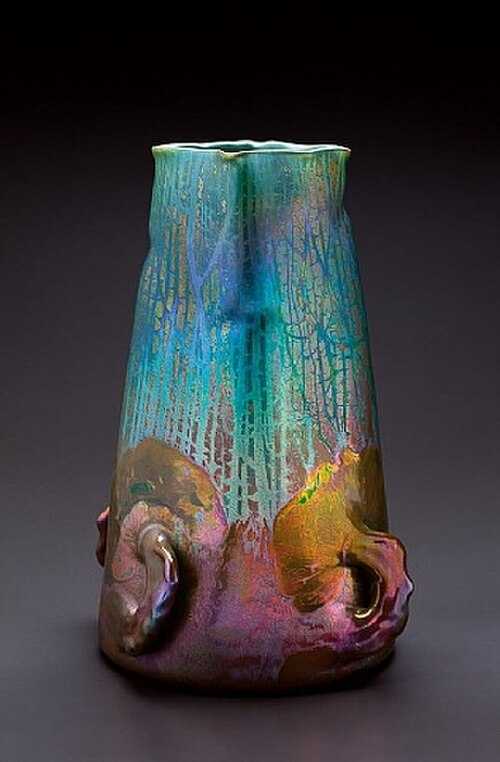


![Moorish Revival – Ceiling in the Filitti House (Calea Dorobanților [ro] no. 18), Bucharest, by Ernest Doneaus, c. 1910](https://img-server.japedia.wiki/wikipedia/commons/thumb/9/93/18_Calea_Doroban%C8%9Bilor%2C_Bucharest_%2804%29.jpg/500px-18_Calea_Doroban%C8%9Bilor%2C_Bucharest_%2804%29.jpg)

During the interwar period and the middle of the 20th century, Modernism was in fashion. To Modernists, form was more important than ornament, so solid blocks of strong colour were often used to emphasize shape and create contrast. Primary colours and black and white were preferred. This is really the case of the Dutch De Stijl movement, which began in 1917. The style involved reducing an object (whether a painting or a design) to its essentials, using only black, white and primary colours, and a simple geometry of straight lines and planes. Gerrit Rietveld's Red and Blue Chair (1917–1918) and Rietveld Schröder House in Utrecht (1924) show this use of colour. Polychromy in Modernist design was not limited to De Stijl. The Unité d'habitation, a residential housing typology developed by Le Corbusier, has some flat colourful parts.
Some Art Deco objects, buildings and interiors stand out through their polychromy and use of intense colours. Fauvism, with its highly saturated colours, like the paintings of Henri Matisse, was an influence for some Art Deco designers. Another influence for polychromy were the Ballets Russes. Leon Bakst's stage designs filled Parisian artistic circles with enthusiasm for bright colours.[70]
Despite their lack of ornamentation, multiple Mid-century modern designs, like Lucienne Day's textiles, Charles and Ray Eames's Hang-It-All coat hanger (1953), or Irving Harper's Marshmallow sofa (1956), are decorated with colours. Aside from individual objects, mid-century modern interiors were also quite colourful. This was also caused by the fact that after WW2, plastics became increasingly popular as a material for kitchenware and kitchen units, light fixtures, electrical appliances and toys, and by the fact that plastic could be produced in a wide range of colours, from jade green to red.[71]

![De Stijl – Panel of polychrome bricks on the exterior of the Vakantiehuis De Vonk [nl], a house in Noordwijkerhout, the Netherlands, by Theo van Doesburg, 1917–1919](https://img-server.japedia.wiki/wikipedia/commons/thumb/5/51/Theo_van_Doesburg_brick_mosaic.jpg/500px-Theo_van_Doesburg_brick_mosaic.jpg)

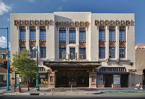


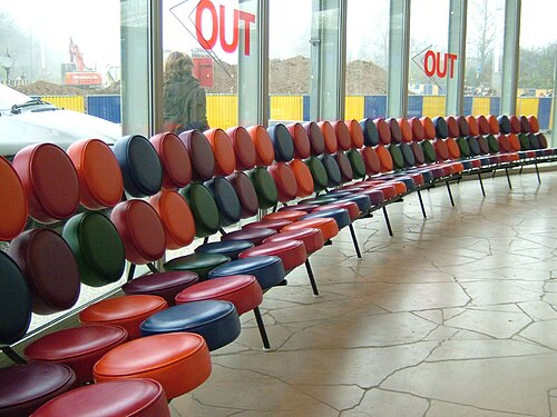


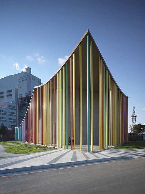
The use of vivid colours continued with Postmodernism, in the 1970s, 1980s and 1990s. Compared to Mid-century modern objects, which often had intense colours but were monochrome, Postmodern design and architecture stand out through the use of a variety of colours on single objects or buildings. Postmodern architects working with bold colors included Robert Venturi (Allen Memorial Art Museum addition; Best Company Warehouse), Michael Graves (Snyderman House; Humana Building), and James Stirling (Neue Staatsgalerie; Arthur M. Sackler Museum), among others. In the UK, John Outram created numerous bright and colourful buildings throughout the 1980s and 1990s, including the "Temple of Storms" pumping station. Aside from architecture, bright colours were present on everything, from furniture to textiles and posters. Neon greens and yellows were popular in product design, as were fluorescent tones of scarlet, pink, and orange used together. Injection-moulded plastics gave designers new creative freedom, making it possible to mass-produce almost any shape (and colour) quickly and cheaply.[80]
An artist well known for her polychrome artworks is Niki de Saint Phalle, who produced many sculptures painted in bold colours. She devoted the later decades of her life to building a live-in sculpture park in Tuscany, the Tarot Garden, with artworks covered in vibrant colourful mosaics.[81]


![Oudhof (Rokin no. 99), Amsterdam, Netherlands, by Mart van Schijndel [nl], 1988–1990](https://img-server.japedia.wiki/wikipedia/commons/thumb/3/3b/De_Wallen%2C_Amsterdam%2C_Netherlands_-_panoramio_%2847%29.jpg/500px-De_Wallen%2C_Amsterdam%2C_Netherlands_-_panoramio_%2847%29.jpg)


Polychrome building facades later rose in popularity as a way of highlighting certain trim features in Victorian and Queen Annearchitecture in the United States. The rise of the modern paint industry following the American Civil War also helped to fuel the (sometimes extravagant) use of multiple colors.


The polychrome facade style faded with the rise of the 20th century's revival movements, which stressed classical colors applied in restrained fashion and, more importantly, with the birth of modernism, which advocated clean, unornamented facades rendered in white stucco or paint. Polychromy reappeared with the flourishing of the preservation movement and its embrace of (what had previously been seen as) the excesses of the Victorian era and in San Francisco, California in the 1970s to describe its abundant late-nineteenth-century houses. These earned the endearment 'Painted Ladies', a term that in modern times is considered kitsch when it is applied to describe all Victorian houses that have been painted with period colors.
John Joseph Earley (1881–1945) developed a "polychrome" process of concrete slab construction and ornamentation that was admired across America. In the Washington, D.C. metropolitan area, his products graced a variety of buildings –all formed by the staff of the Earley Studio in Rosslyn, Virginia. Earley's Polychrome Historic District houses in Silver Spring, Maryland were built in the mid-1930s. The concrete panels were pre-cast with colorful stones and shipped to the lot for on-site assembly. Earley wanted to develop a higher standard of affordable housing after the Depression, but only a handful of the houses were built before he died; written records of his concrete casting techniques were destroyed in a fire. Less well-known, but just as impressive, is the Dr. Fealy Polychrome House that Earley built atop a hill in Southeast Washington, D.C. overlooking the city. His uniquely designed polychrome houses were outstanding among prefabricated houses in the country, appreciated for their Art Deco ornament and superb craftsmanship.
Native American ceramic artists, in particular those in the Southwest, produced polychrome pottery from the time of the Mogollon cultures and Mimbres peoples to contemporary times.[91]
In the 2000s, the art of designing art toys was taking off. Multiple monochrome or polychrome vinyl figurines were produced during this period, and are still produced during the 2020s. A few artists who designed vinyl toys include Joe Ledbetter, Takashi Murakami, Flying Förtress, and CoonOne1.
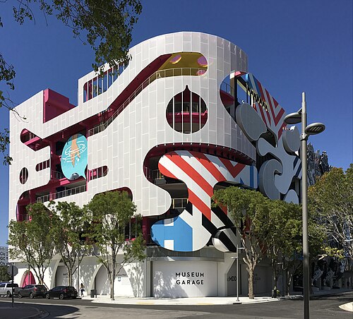
During the 2010s and the early 2020s, a new interest for Postmodern architecture and design appeared. One of the causes were memorial exhibitions that presented the style, the most comprehensive and influential one being held at the Victoria & Albert Museum in London in 2011, called Postmodernism: Style and Subversion 1970–1990. The Salone del Mobile in Milan since 2014 showcased revivals, reinterpretations, and new postmodern-influenced designs.[92] Because of this, multiple funky polychrome buildings were erected, like the House for Essex, Wrabness, Essex, the UK, by FAT and Grayson Perry, 2014[93] or the Miami Museum Garage, Miami, US, by WORKac, 2018.[94]
Besides revivals of Postmodernism, another key design movement of the early 2020s is Maximalism. Since its philosophy can be summarized as "more is more", contrasting with the minimalist motto "less is more", it is characterized by a wide use of intense colours and patterns.

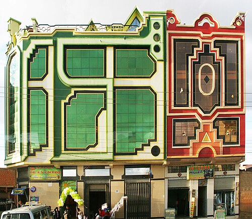




The term polychromatic means having several colors. It is used to describe light that exhibits more than one color, which also means that it contains radiation of more than one wavelength. The study of polychromatics is particularly useful in the production of diffraction gratings.
{{cite book}}: CS1 maint: multiple names: authors list (link){{cite book}}: CS1 maint: multiple names: authors list (link){{cite book}}: CS1 maint: multiple names: authors list (link){{cite web}}: CS1 maint: deprecated archival service (link)


